
Information Center
In the Information Center you will find everything you need to know about SobiPro and its applications!
It is also the place to download SobiPro, its applications and language packages.
Applications
Enhance your directories!
Get additional functionality for SobiPro with our applications.
Templates
Design your directories!
Check out the different SobiPro templates we have created for you.
Languages
Let your directories speak your language!
SobiPro is translated into more than 30 languages.
The default Template
Template Settings V6
The default template included in SobiPro is a sophisticated template with a lot of features implemented, using a loop to show the fields defined in the fields manager. The most recent version of the default template is default6. The default6 template is based on Bootstrap 3.
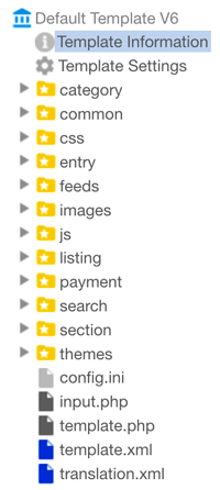
Since template version V3, the default template comes with its own settings screen which is improved continuously. You can reach these settings for one of your sections by navigating to SobiPro's Control Panel and clicking on a section name from the sections list, or by selecting the section from the drop-down button. Once the section opens, select the from the menu on the left and then click on Template Settings.
When saving the settings by clicking on on the upper right corner, the configuration will be saved, the LESS file(s) will be compiled and JSON files, containing the settings will be generated.
Please note that you need to have the PHP Phar extension installed on your server. Otherwise the LESS compiler does not work and as a result the template settings can't be saved!
General Settings
In this section you will find settings concerning the template as a whole.
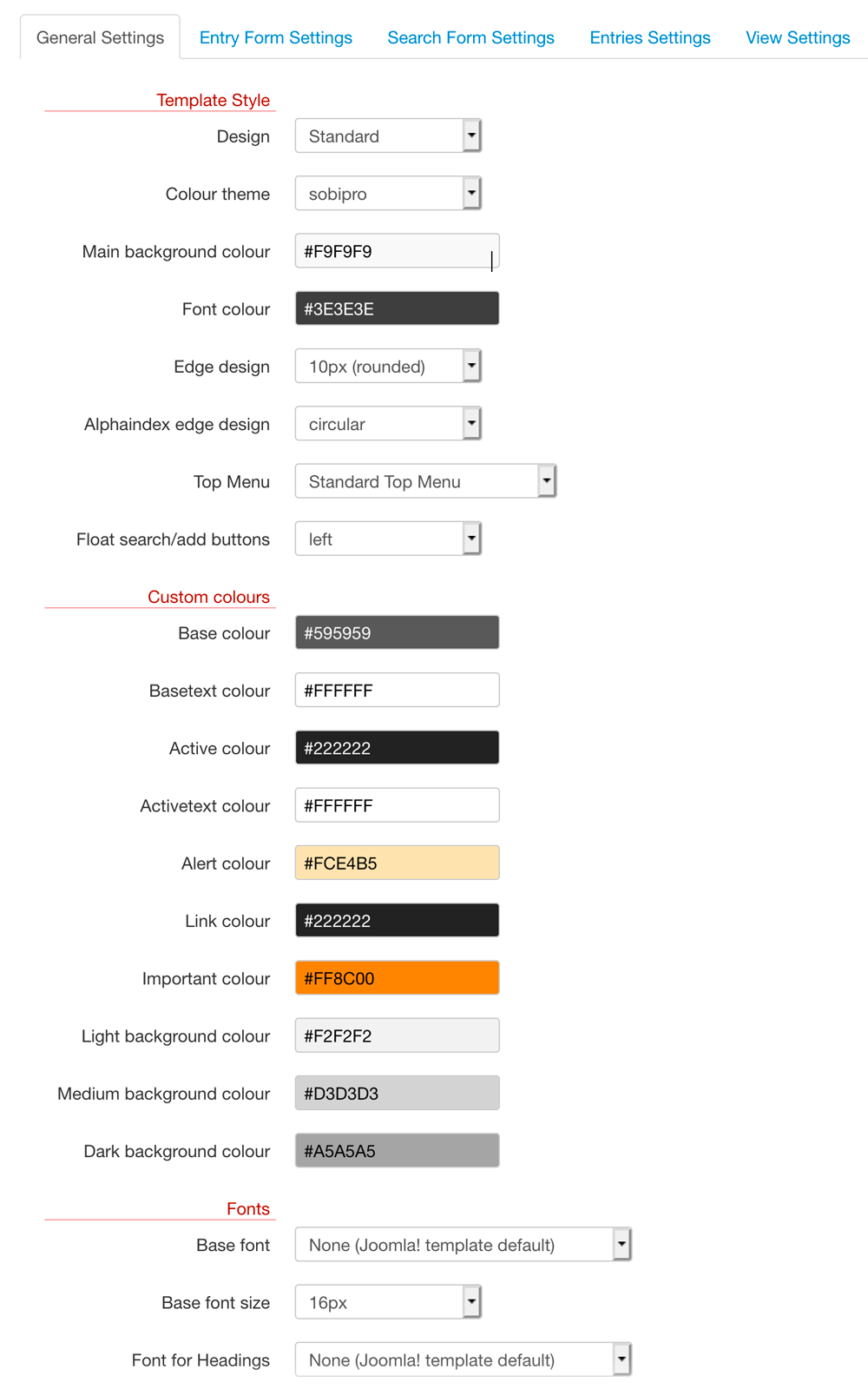
Template Style
The default template comes with the possibility to change the style of the template. These are the possibilities to choose from different colour themes or to define a colour set, to change the style of the edges and of the top menu. In order these changes take effect, SobiPro modifies the template file theme.less and compiles it.
DO NOT modify the file theme.less, otherwise the whole mechanism may not longer work!
If you need to make changes, make them in the file custom.less (formerly default.less), or if you do not want to use the LESS file, in
custom.css (formerly default.css) only!
- Design
-
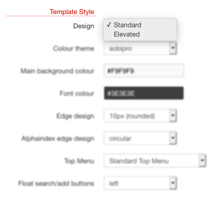 There are two different designs available, the well-known Standard design, and the Elevated design, which is similar
to Google's Material design.
- Colour theme
-
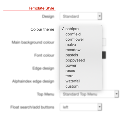 There are several different colour themes available to choose from. They change the used colour for all elements on front-end. Use the theme
custom to define your own colours.
- Main background colour
- Select the colour of the background of the SobiPro area. Ideally this is your Joomla template's background colour. Make sure that the selected colour fits to the selected colour theme.
- Font colour
- Select the colour of the main font for SobiPro. Ideally this is your Joomla template's font colour. Make sure that the selected colour fits to the selected colour theme.
- Edge design
-
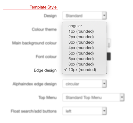 Choose from angular, 1px, 2px, 3px,
4px, 5px, 6px, 8px or 10px to get an
angular or rounded elements on front-end.
- Alphaindex edge design
-
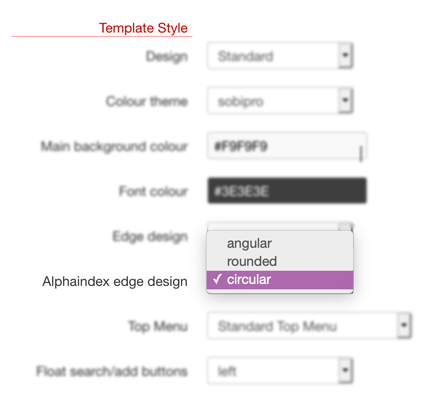 Choose from angular, rounded or circular to get angular, rounded or circular letter
elements on front-end.
- Top Menu
-
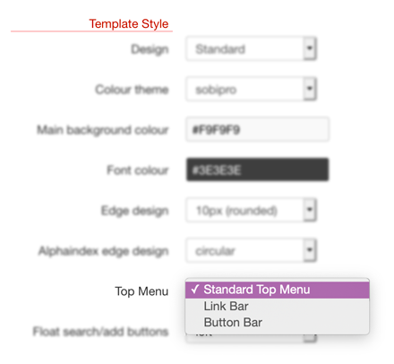
Select between Standard Top Menu, Link Bar and Button Bar to select one of the different top menu styles.
Standard Top Menu:

Link Bar:

Button Bar:

- Float Search/Add Buttons
-
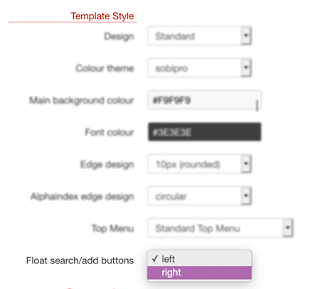 Select between left and right to float the search and add button to the left or right. This setting is valid ONLY for
the Top Menu option set to Button Bar!
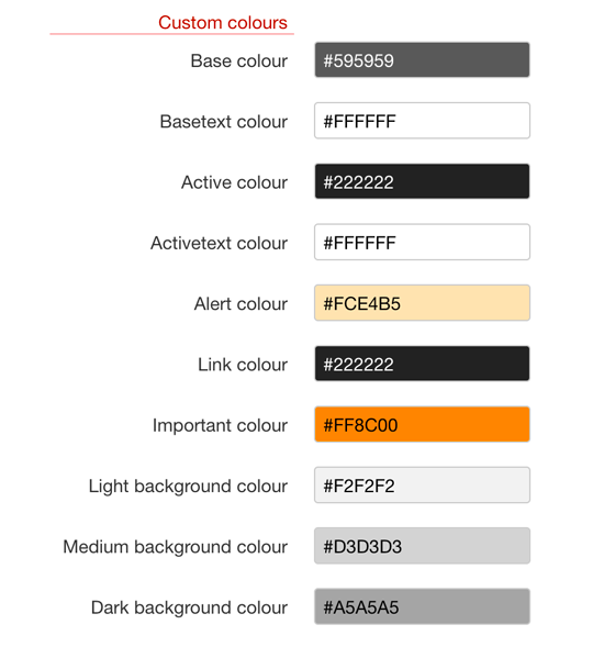
Custom colours
When selecting custom from the Colour themes list, you can define your own colour set. Please see the documentation Create a custom colour set.
Fonts
The used fonts can be changed to another font from a predefined list of Google fonts. The fonts will be loaded from Google CDN (Internet connection necessary).
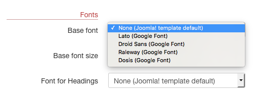
Selecting a font does NOT change the font of non-SobiPro areas on your site!
- Base font
- The base font is the font, used for all texts in SobiPro elements. If you do not want to use a specific font in SobiPro, but the font inherit from your Joomla! template, select None (Joomla! template default). This is the default setting.
- Base font size
- Select the size of the base font. Use this setting to adapt the font size for SobiPro elements to your used Joomla template.
SobiPro calculates the sizes for its different elements based on the base font size. - Font for Headings
- Select a Google font used for SobiPro heading elements
<h1>,<h2>,<h3>and<h4>. If you do not want to use a specific font for heading elements in SobiPro, but the font inherit from your Joomla! template, select None (Joomla! template default). This is the default setting.
Fonts information for nerds
You do not need to know the following information to use specific fonts for SobiPro! Nevertheless, if you experience problems with fonts, you may check it though.
To change the font size, there is support in the template needed as the font is changed by calling a few PHP function slocated in the template.
These PHP functions are available in the template's template.php file. For the default6 template these are the following functions:
public static function LoadFont ($name) {
  SPFactory::header()->addHeadLink("//fonts.googleapis.com/css?family=" . $name,"text/css", null,"stylesheet");
}
public static function ApplyBaseFont ($name) {
  SPFactory::header()->addCSSCode(".SobiPro.default6 {font-family:'". $name ."', sans serif;}");
}
public static function ApplyFont ($name) {
  SPFactory::header()->addCSSCode(".SobiPro.default6 h1,
                   .SobiPro.default6 h2,
                   .SobiPro.default6 h3,
                   .SobiPro.default6 h4 {font-family:'". $name ."', sans serif;}");
}
As you see, there is a template reference (default6) used in these functions. This is the template id as given in the file template.xml. If you copy the template using the integrated duplicate template function, SobiPro will change these references for you. If you copy the template manually, not using SobiPro, you need to change these references manually.
The call of these above mentioned functions is within the file common/topmenu.xsl as follows:
<xsl:if test="//config/basefont/@value != 'none' and //config/basefont/@value != ''">
  <xsl:value-of select="php:function( 'tpldefault6::LoadFont', $basefont)"/>
  <xsl:value-of select="php:function( 'tpldefault6::ApplyBaseFont', $basefont)"/>
</xsl:if>
<xsl:variable name="specialfont"><xsl:value-of select="//config/specialfont/@value"/></xsl:variable>
<xsl:if test="$basefont != $specialfont and //config/specialfont/@value != '' and //config/specialfont/@value != 'none'">
  <xsl:value-of select="php:function( 'tpldefault6::LoadFont', $specialfont)"/>
  <xsl:value-of select="php:function( 'tpldefault6::ApplyFont', $specialfont)"/>
</xsl:if>
As you see, there is a template reference (tpldefault6) used in these functions. This is the name of the abstract PHP class in the file template.php. If you copy the template using the integrated duplicate template function, SobiPro will change these references for you. If you copy the template manually, not using SobiPro, you need to change these references manually.
Entry Form Settings
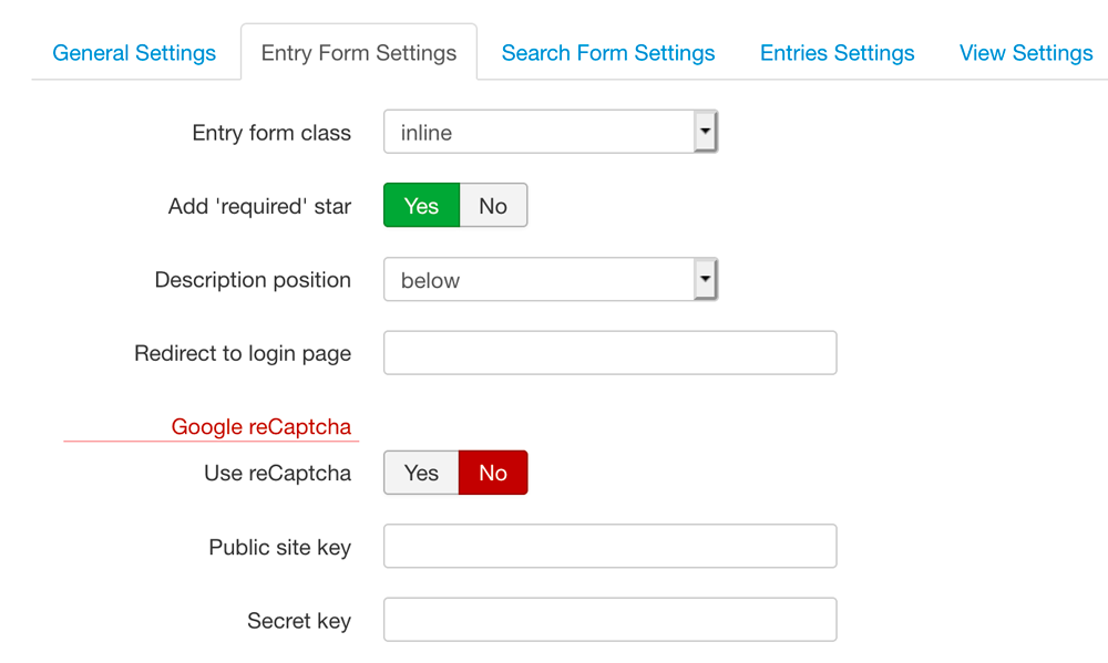
- Entry form class
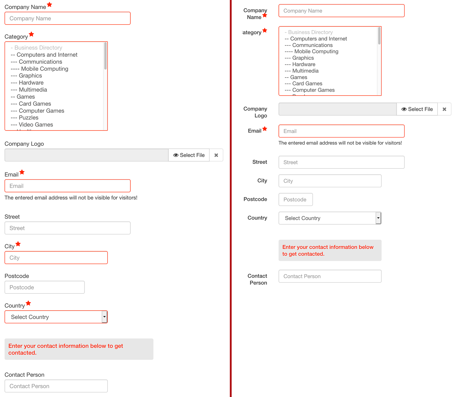
- The settings horizontal and inline are available.
Below you will see the difference between inline (left) and horizontal (right).
- Add 'required' star
- Adds a 'star' icon ( ) to the label if input is required.
- Description position
- You can choose how the text should be shown. The possibilities are below, above, on the right side and popup, where popup is the way older default templates used. Otherwise the text is shown below or above the input area.
- Redirect to login page
- If only registered users may add or edit an entry, the button in the top menu is not visible for guests. If you want to have it visible, but redirects to a login page, enter the URL (relative or absolute) for that login page in this field. In this case the button in the top menu is visible, but redirects to the login page or your site.
Google reCAPTCHA
You can use Google reCAPTCHA v2 type Checkbox with the entry form. At Google, you need to sign up for an API key pair for your site. Once you have the key pair you need to enter it in the corresponding fields in the template settings.
- Use reCaptcha
- Set it to Yes in order to use Google reCAPTCHA.
- Public site key
- Enter the public site key you've got from Google.
- Secret key
- Enter the secret key you've got from Google.
Search Form Settings
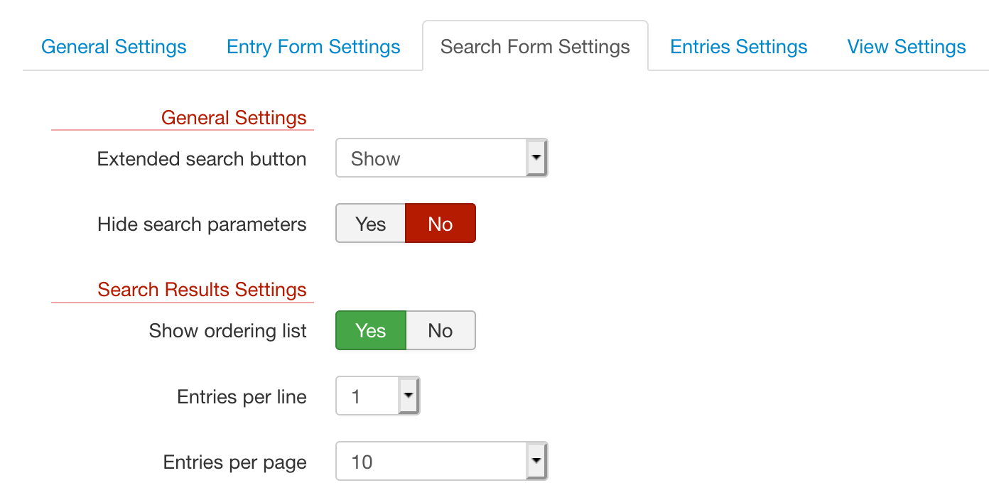
The search form has general settings and settings for the search results.
General Search Settings
- Extended search button
- Show or Hide the extended search button in the search form. The extended search button will be shown as soon as you
select at least one field to be searchable not only via the general search input box. It is placed right of the button. If pressed,
the additional search elements will be shown. If you have only one or a few additional search elements, it may be appropriate to show them all at once.
Please note, the search elements are always on top of the search results, so it is not advisable to hide the button if you have a lot of search elements.

- Hide search parameters
- If set to Yes, the search parameters are hidden after performing a search. A button is
available to open the search parameters again.
As this feature is meant for having a lot of extended search parameters shown (Extended search button is set to Hide), an additional button and a button are shown below the extended search parameters.
Search Results Settings
- Show ordering list
- The ordering of the results can be changed from front-end. For that a drop-down list with those items which are selected for Orderings Items
(General Configuration ➜ Template ➜ Search Settings ➜ Ordering Items) will be shown on the search results page. To get that drop-down list, it has to be switched on by
setting Show ordering list to Yes.
The ordering list does not work if By Priority is chosen as ordering value.
- Entries per line
- Number of entries (vCards) shown in one line.
- Entries per page
- Number of entries (vCards) shown at once on the search results page. If there are more results available, the pagination is shown.
Entries Settings
Find here settings for the entries in the different views.
General Features
Settings for entries in vCard view (all listing views) and details view.
- Show 'no image' placeholder
-
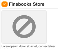 If an entry should have an image, but no image is uploaded, it is possible to show a 'no image' placeholder instead. Size and color of the placeholder depend on other
settings (chosen colour theme, image ratio, ...).
Choose from No, Yes and Controlled. When set to Yes, all image
fields gets a placeholder image if no image is available. If you have several image fields, this is an unwanted behaviour as only the main image should get such a
placeholder. In this case set it to Controlled and add the CSS class
 placeholderto the CSS class in the the field's Entry View Field Settings in the fields manager. Only fields with this CSS class added will get a placeholder.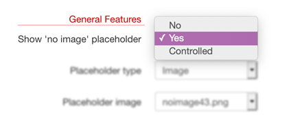
- Placeholder type
-
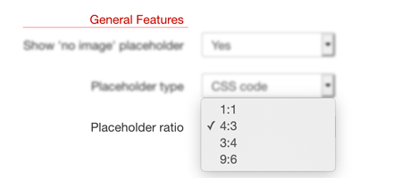
Select between CSS code and Image. If CSS code is chosen, the placeholder will be created
via CSS using a Font Awesome icon. Select the ratio of the placeholder at Placeholder ratio right below.
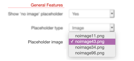
If Image is chosen, the placeholder will be an image located in the template folder images. Select the image and with that the ratio of the image at Placeholder image right below. Of course you can create your own images and name them accordingly.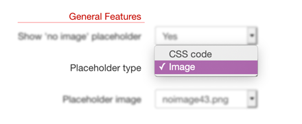
- Placeholder ratio
-
The ratio of the placeholder if Placeholder type is set to CSS code. The following values are available:
- 1:1
- 4:3
- 3:4
- 9:6
- Placeholder image
-
Select the image if the Placeholder type is set to Image. The following images are available:
- noimage11.png ➜ ratio 1:1
- noimage43.png ➜ ratio 4:3
- noimage34.png ➜ ratio 3:4
- noimage96.png ➜ ratio 9:6
 Of course you can create your own images and name them accordingly.
Details View
Settings for entries in the details view.
- Image width
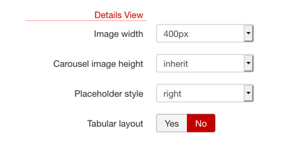
- The width of the image in the details view. Having a site responsive means, that the size of the image will be changed dynamically with the viewport size of the different
devices. Hence it is necessary to upload a bigger image, otherwise the image may be blurred because it is shown in a bigger size than the upload settings of the image field
allow. To reduce the size for specific views, as the details view, choose from an image size here. Select inherit if you want to use the settings
from the image field. The following values are available:
- inherit
- 100px
- 150px
- 180px
- 200px
- 250px
- 300px
- 350px
- 400px
- 500px
- 600px
- 800px
- Carousel image height
- The image height of a carousel gallery if used. Specific SobiPro templates make use of this setting.
- Placeholder style
- Select the style for the placeholder in details view (only if placeholder is used). Choose from none, left and right.
- Tabular layout
-
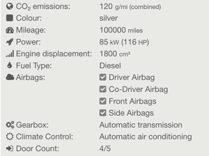 Choose Tabular layout if the fields should be shown in a tabular form. Using this style does make sense only if the labels for the fields are
shown.
vCard
Settings for entries in the listing views (vCards).
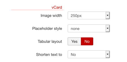
- Image width
- The width of the image in the details view. Having a site responsive means, that the size of the image will be changed dynamically with the viewport size of the different
devices. Hence it is necessary to upload a bigger image, otherwise the image may be blurred because it is shown in a bigger size than the upload settings of the image field
allow. To reduce the size for specific views, as the vCard (in all listing views), choose from an image size here. Select inherit if you want to
use the settings from the image field. The following values are available:
- inherit
- 80px
- 100px
- 120px
- 150px
- 180px
- 200px
- 250px
- 300px
- 400px
- 500px
- 600px
If you choose a higher image size, make sure to set the image dimensions in the field settings also to a higher value. Otherwise the image will be blurred.
- Placeholder style
- Select the style for the placeholder in the listing views (only if placeholder is used). Choose from none, left and right.
- Tabular layout
-
 Choose Tabular layout if the fields should be shown in a tabular form. Using this style does make sense only if the labels for the fields are
shown.
- Shorten text to
- You can shorten the text of textarea fields if no WYSIWYG editor is used. For that, set the number of characters here and add the class
shortento the CSS class in the the textarea's Entry View Field Settings in the fields manager.This works only if NO WYSIWYG editor is used!
The following values are available:- No
- 50 characters
- 100 characters
- 150 characters
- 200 characters
- 300 characters
- 500 characters
- 1000 characters
View Settings
Settings for for different listing views.
View Features
Special features concerning all listing views.
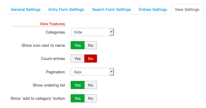
- Categories
- Show or Hide. If Hide is selected, the categories list isn't shown by default and you will get a button to show and hide the categories container. If Show is selected, the categories list is shown always.
- Show icon next to name
-
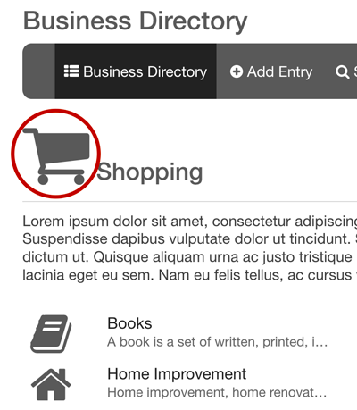 Select if the category icon should be shown next to the category name in the category's view.
- Count entries
- Select if the number of entries in a category should be shown in brackets at the right side of the category name.
- Pagination
- Choose between Standard and Ajax. With Standard, you will get the standard pagination. Each
new page reloads the whole page. With Ajax, you will get only a Read More button and the next entries are loaded below the previous ones without refreshing the page.
The standard pagination is active in background also if Ajax is selected and comes up if Ajax can't work due to an error.
- Show ordering list
- The ordering of the entries in the category view can be changed from front-end. For that a drop-down list with those items which are selected for Orderings Items (General Configuration ➜ Template ➜ Category Settings ➜ Ordering Items) will be shown on the category page. To get that drop-down list, it has to be switched on by setting Show ordering list to Yes.
- Show 'add to category' button
- Adds a button 'add to category' to the category views to let the user add an entry directly to this category (category is preselected).
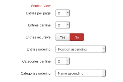
Section View
Settings for the section view only. The section view is the main view of a section.
- Entries per page
- Number of entries (vCards) shown at once in the section view. If there are more entries available, the pagination is shown.
- Entries per line
- Number of entries (vCards) shown in one line.
- Entries recursive
- Show entries Yes or no entries No.
- Entries ordering
-
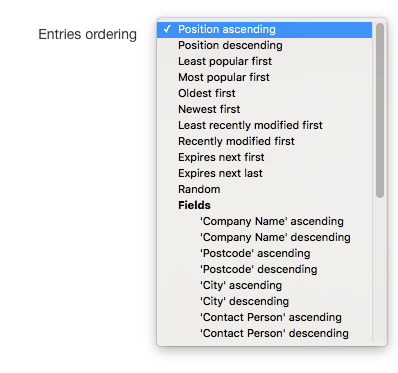 Select the ordering, the entries should be shown. Depending on the fields you have, the Fields orderings may differ.
- Categories per line
- Number of categories shown in one line.
- Categories ordering
-
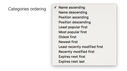 Select the ordering, the categories should be shown.
Category View
Settings for the category views.
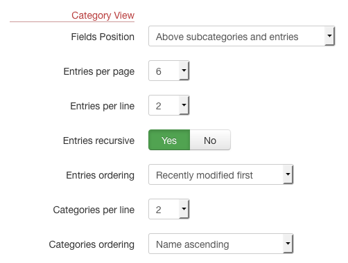
- Fields Position
- Determine where the category fields should be shown in the category view. Select between Above subcategories and entries, Between subcategories and entries and Below subcategories and entries.
- Entries per page
- Number of entries (vCards) shown at once in a category view. If there are more entries available, the pagination is shown.
- Entries per line
- Number of entries (vCards) shown in one line.
- Entries recursive
- Show also entries from sub-categories Yes or not No.
- Entries ordering
- Select the ordering, the entries should be shown. Depending on the fields you have, the Fields orderings may differ.
- Categories per line
- Number of categories shown in one line.
- Categories ordering
- Select the ordering, the categories should be shown.
Listing View
Settings for all other listing views (e.g. alpha view).
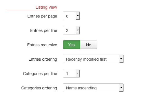
- Entries per page
- Number of entries (vCards) shown at once in a listing view. If there are more entries available, the pagination is shown.
- Entries per line
- Number of entries (vCards) shown in one line.
- Entries recursive
- Show also entries from sub-categories Yes or not No.
- Entries ordering
- Select the ordering, the entries should be shown. Depending on the fields you have, the Fields orderings may differ.
- Categories per line
- Number of categories shown in one line.
- Categories ordering
- Select the ordering, the categories should be shown.
Only the field types inbox, single select, checkbox and calendar will be available for field ordering.
If you order the entries by field, make sure that each entry has a value for that field, otherwise the entry won't be shown at all. This is important especially for 'Yes/No' checkbox fields. If you have only a 'Yes' field, but no 'No' field, only the entries with the 'Yes' field set are shown.
Deprecated Settings
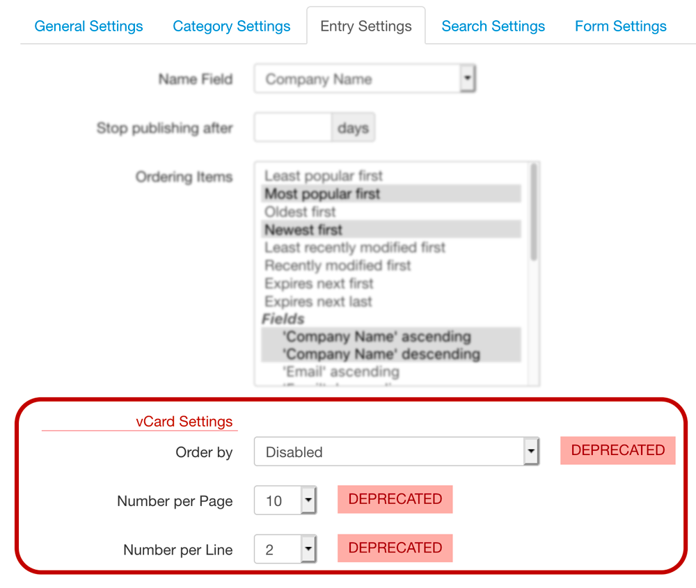
Some entries settings render the same settings in SobiPro ➜ ➜ ➜ Template ➜ Entry Settings ineffective. These are the Entries ordering (Order by), Entries per page (Number per Page) and Entries per line (Number per Line). They will be removed in the next major version of SobiPro! They still exist for templates which does not have them in the template settings. If your SobiPro template does not have these settings, you need to contact your template developer and ask for an updated version.
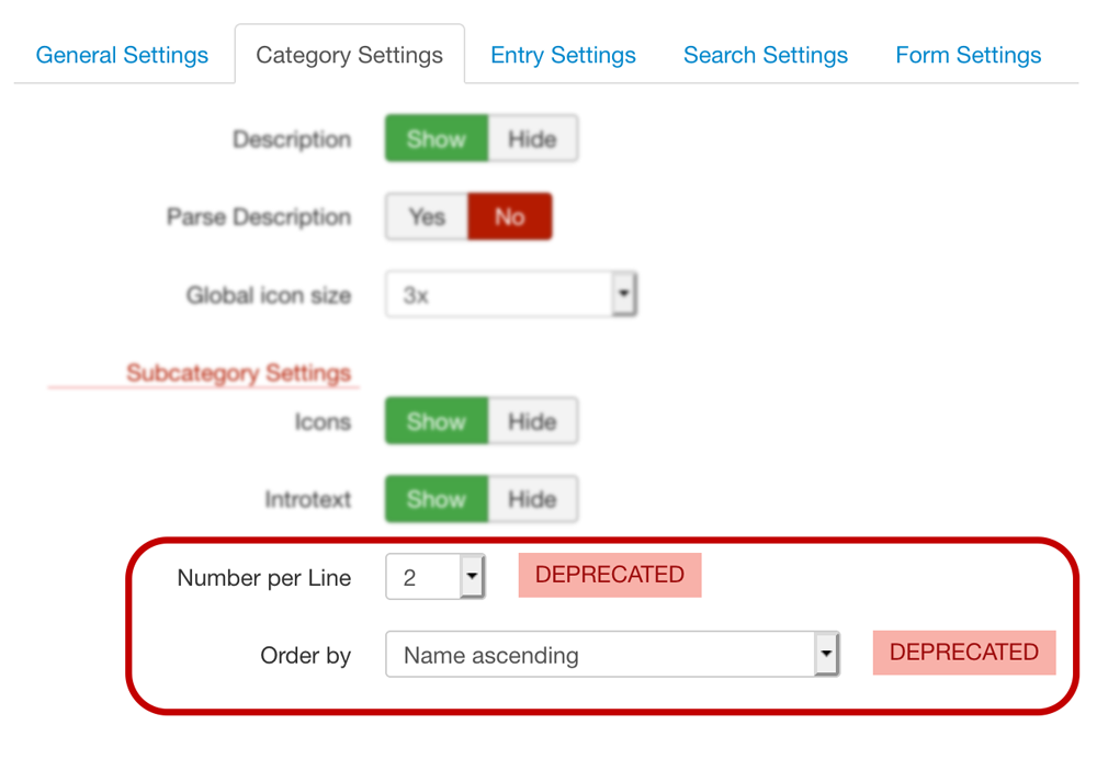
Some categories settings render the same settings in SobiPro ➜ ➜ ➜ Template ➜ Category Settings ineffective. These are the Categories ordering (Order by) and Categories per line (Number per Line). They will be removed in the next major version of SobiPro! They still exist for templates which does not have them in the template settings. If your SobiPro template does not have these settings, you need to contact your template developer and ask for an updated version.
RSS Feeds
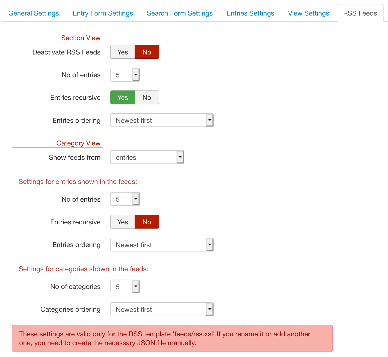
These are the settings for the RSS feeds. The older method of an INI file in the folder feeds will be replaced by these template settings. The settings are written so the file rss.json. The following settings are valid only for the RSS template file feeds/rss.xsl If you rename it or add another one, you need to create the necessary JSON file manually.
By default RSS feeds are generated from section view and from category views.
Section View
- Deactivate RSS Feeds
- You can switch off the generation of RSS feeds by setting Deactivate RSS Feeds to Yes.
- No. of entries
- The number of entries shown in the feeds.
- Entries recursive
- Show only entries from the main categories or also from sub-categories.
- Entries ordering
- Select from Newest first or Recently modified first.
Category View
- Show feeds from
- With implementation of the category fields, it can be useful to have RSS feeds for categories. Select if feeds should be shown from entries (default), categories or from both.
Settings for entries shown in the feeds:
- No. of entries
- The number of entries shown in the feeds.
- Entries recursive
- Show only entries from the main categories or also from sub-categories.
- Entries ordering
- Select from Newest first or Recently modified first.
Settings for categories shown in the feeds:
- No. of categories
- The number of categories shown in the feeds.
- Categories ordering
- Select from Newest first or Recently modified first.
Applications
There may be a tab Applications with settings from different applications.
Copyright (C) 2006-2024 Sigsiu.NET GmbH (https://www.sigsiu.net). All rights reserved.
This documentation and all images therein are copyrighted and protected by law. You may not publish, distribute or sell them or parts of it without explicit written permission of Sigsiu.NET GmbH.

